Log in Register

Login to your account

Username *
Password *
Remember Me

Create an account

Fields marked with an asterisk (*) are required.
Name *
Username *
Password *
Verify password *
Email *
Verify email *

Search Ideabase

Industry
Company
Agency
Country
Prize
Year
Creative Concept
Type of content
Language
Level
Topics
Max's favourites

Folkoperan - Branding Case

Folkoperan - Branding Case

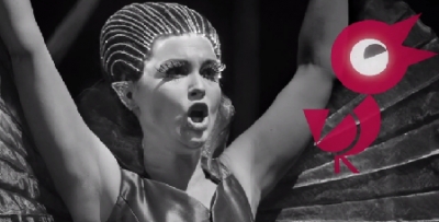
People’s perception of Folkoperan is largely shaped by the plays they put on, and less by their reason to be – to make opera more accessible to everyone, regardless of age and background. This was the reason for a new design programme. The Art Deco inspired Opera house building. The building’s colourful red interior is carried through in our stationery and packaging. The bird itself is also made up from typographic elements based on strict geometric shapes of the logotype’s early 20th century inspired forms. (http://www.lowebrindfors.se)